Case Study
Cactus Financial


Cactus Financial
August 2022 - March 2023
Overview
Problem Statement
People use ApplePay, FaceID, and automatic input to sign up for apps, subscriptions, and payments. They experience frustration from not knowing when the card is being charged. It’s only when they’re looking at a bank statement do they know that they were charged.
Design Process
Initial Thinking
Individuals who manage the finances for themselves and their families.
Individuals who are less experienced in managing money.
Online Survey (Google Form)
Online Research
In-Person Interviews
How Might We Questions
User Research
Background Research
Research Goals
Discover
Discover people’s end-to-end journey when considering, purchasing, and using a content-based subscription, or a Service-Based Subscription (SaaS).
Understand
Understand the current process of maintaining recurring transactions. As well as personal finance preferences.
Evaluate
Evaluate the current pain points and any overarching difficulties customers are facing in this space.
Identify
Identify opportunities for features of personal banking.
User Interviews
Five interviews were conducted in person with a set of pre-determined questions. Interviewers were screened to have a diverse age range, gender, and financial stability.
Key Quotes
"… I get so used to auto-paying credit card bills. It's hard to always be looking at each statement to catch unwanted recurring charges."
"Sometimes when I set up a subscription but I don't set up an account with the company, I don't receive alerts that I'm going to be charged soon, so that's been annoying in the past."
"If all of my subscriptions could be managed in one place, I think I could integrate that information with budgets I already have. I wish I could see things like what I'm subscribed to, when I'll be charged, and how much, etc."
I wish I had a platform that shows what I'm subscribed to and gives me an alert before the next charge. I'm pretty sure this exists but it also sounds like a pain to input all of my subscriptions and give them all of my login credentials.
Affinity Map
An affinity map was an easy way to identify key themes from the User Interviews. Key quotes, blurbs, and examples were pulled from the transcripts and placed on digital post-it notes. From there, each post-it was placed into a key theme.

Analyze
Key Takeaways
Easy Sign Ups are Enticing
It’s easy to sign up for something, but intentionally difficult to unsubscribe.
Most people find recurring charges by looking directly are their credit card statements.
Mobile banking apps don’t automatically bucket or group recurring charges in the spending reports. This does not provide enough detail to the user.
Lack of Communication for Upcoming Charges
Users don’t know preemptively that their card is being charged. Most participants noted having to make a specific calendar reminder.
As of July 1, 2022, any company that offers a subscription with a term of one year or more, or a free trial period greater than 31 days must send the users a reminder notice before renewal. (Link)
Personal Finance data is not Easily Customizable
Mobile banking apps don’t allow for specific information to be aggregated in one place. Specifically on the home page or dashboard setting.
Some users wished to have guidelines before purchasing - how it would impact their budgets, etc.
User Personas


Empathy Map


Site Map

User Flow
Creating a User flow was an easy way to map out the needs of the app and the flow of the user. Each flow attempts to provide ways in which the user could follow to have a better understanding and control of their finances.

Design
Initial Sketches


Wireframes


Design Concept
Color Pallet

Logo
Typography

Iconography

Design Solutions
High Fidelity Designs
01
One Organized Platform
Platform with all financial information in one place. The home screen displays all linked accounts from different bank establishments and a hub for all user flows. Displays current spending, account balances, current subscriptions, budgets, and the digital wallet.


02
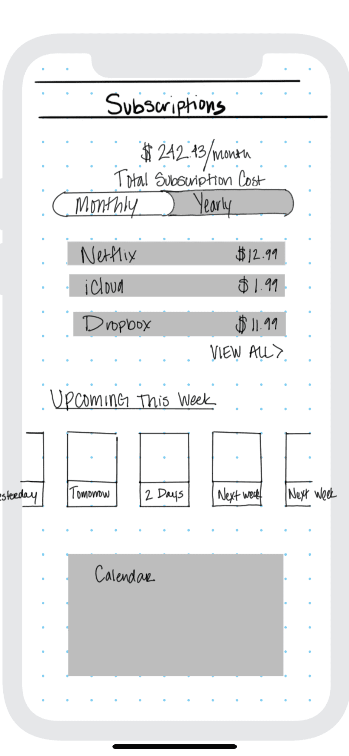
Recurring Charges Only Dashboard
Isolating the recurring charges and subscriptions to one page provides a solution to the lack of awareness of subscriptions. The user can toggle between what they pay for on an annual or monthly schedule. There is a calendar view and a list of upcoming renewals.
03
Personal Budget Tracker
On the budget page, the user can see a high-level view of their overall spending per category with the circular graph. Where they stand in their monthly budget and then a further breakdown of each category's spending activity.


Digital Wallet
The digital wallet provides an opportunity for the user to pay for their recurring charges with this debit card. Thus having more control and awareness - the in-app card can track spending, fees, automatic payments, and more.
User Testing Feedback
User Testing Results
Overall the feedback on the high-fidelity designs was well received. There were minor technical fixes that were called out and addressed. However, the users did not feel that they were receiving enough awareness about their spending and upcoming charges. From there, we added a homepage for Reminders which showed the users all their upcoming reminders and settled our initial problem statement of having more awareness of finances. In addition, we added a page that showed customization of details for recurring charges. This also supported the goal of providing more awareness to the user.

Post User Testing - Screen Iteration


Reflection
Takeaways
This project has focused on user research, data analysis, and identified needs. As a team of one, and creating my first product from the ground up, Cactus Financial allowed me to think critically as a UX Designer while expanding my design skills into a mobile app.
Since this is a student project, there were little to no constraints to the design decisions. It was not a perfect experience, as the user research had some challenges. Participant recruitment was the responsibility of the student which posed certain biases on the results.
Actionable Next Steps
Complete further User Testing around the notifications and reminders.
How do Users respond to the reminder notifications? Is it effective?
Build out a data summary page for spending insights.
Cactus Financial is great at displaying and quantifying financial data, but what does that mean from a user's POV? "Here's all your data, now here's what to do with it"
Complete unbiased user research with Usability Testing, A/B Testing, or Unmoderated Testing.
Test the true success of the app with measurable results and feedback.