Cactus: Financial
IOS APP
IOS APP
IOS APP
Cactus is a financial budgeting application designed to help users feel confident about their finances. It provides a overview of your spending, how you are tracking within your budgets, and helps you keep track of recurring payments.
Cactus is a financial budgeting application designed to help users feel confident about their finances. It provides a overview of your spending, how you are tracking within your budgets, and helps you keep track of recurring payments.
Cactus is a financial budgeting application designed to help users feel confident about their finances. It provides a overview of your spending, how you are tracking within your budgets, and helps you keep track of recurring payments.
Cactus is a financial budgeting application designed to help users feel confident about their finances. It provides a overview of your spending, how you are tracking within your budgets, and helps you keep track of recurring payments.
MY ROLE
MY ROLE
MY ROLE
Research, Analysis, Product Design, Interaction Design, Design Systems, User-testing.
Research, Analysis, Product Design, Interaction Design, Design Systems, User-testing.
Research, Analysis, Product Design, Interaction Design, Design Systems, User-testing.
UX Researcher
Product Designer
Brand/Visual Designer
UX Researcher
Product Designer
Brand/Visual Designer
TIMELINE
TIMELINE
August 2022 - March 2023
August 2022 - March 2023
TIMELINE
TIMELINE
August 2022 - March 2023
August 2022 - March 2023
August 2022 - March 2023
TOOLS
TOOLS
TOOLS
Figma
Figma
Figma
Figma
DESIGN PROCESS
DESIGN PROCESS
DESIGN PROCESS
OVERVIEW
OVERVIEW
OVERVIEW
Problems
Problems
Problems
Users keep track of subscriptions made through Apple and Google and can be managed through their system. This does not account for payments made directly to the brand, company, or provider.
There are multiple locations to track changes. The users have to go to several different places to track where the payments are made. Email receipts, specific websites, bank statements, etc.
Financial tools aren't specific enough. Financial trackers use financial data from credit cards, debit cards, and bank statements. Does not formulate the type of charge- monthly, yearly, etc.
Feedback: Users must manually track their expenses. If the user is not using a financial tracker, then the user must review the bank statements to keep track of charges.
Goal
Goal
Goal
Satisfy users' needs and help them achieve a strong understanding of their financial well-being. To create a user-friendly and effective tool that provides users with all the features and capabilities they need to improve their financial health, maintain awareness of spending, and simplify keeping track of recurring charges.
Satisfy users' needs and help them achieve a strong understanding of their financial well-being. To create a user-friendly and effective tool that provides users with all the features and capabilities they need to improve their financial health, maintain awareness of spending, and simplify keeping track of recurring charges.
Satisfy users' needs and help them achieve a strong understanding of their financial well-being. To create a user-friendly and effective tool that provides users with all the features and capabilities they need to improve their financial health, maintain awareness of spending, and simplify keeping track of recurring charges.
Satisfy users' needs and help them achieve a strong understanding of their financial well-being. To create a user-friendly and effective tool that provides users with all the features and capabilities they need to improve their financial health, maintain awareness of spending, and simplify keeping track of recurring charges.
This includes:
Displaying an overview of the users' connected bank accounts.
Infographics of the following:
Spent vs earned
Budget category spend
Recurring category spend
This includes:
Displaying an overview of the users' connected bank accounts.
Infographics of the following:
Spent vs earned
Budget category spend
Recurring category spend
This includes:
Displaying an overview of the users' connected bank accounts.
Infographics of the following:
Spent vs earned
Budget category spend
Recurring category spend
This includes:
Displaying an overview of the users' connected bank accounts.
Infographics of the following:
Spent vs earned
Budget category spend
Recurring category spend
USER RESEARCH
USER RESEARCH
USER RESEARCH
Persona
The user research stage of Cactus' development process involved conducting interviews, surveys, and usability tests with individuals who manage the finances for themselves and their families.
During the interviews, I asked questions about their end-to-end journey when managing their spending with a specific interest in subscription or repeating payments. I asked about their preferred methods of financial tracking, as well as their pain points when it comes to managing money.
Jesse
Age: 38
Business Owner
PAIN POINT
Jesse finds it difficult to track his spending with his wife, wants to see overall where they stand so they can save for a house.
Ava
Age: 27
Marketing Associate
PAIN POINT
Ava is not confident in her financial management. She needs more information on her spending habits.
Molly
Age: 48
Stay-at-Home Mom
PAIN POINT
Molly finds it difficult to manage spending when everything is on auto-pay. She wants to oversee her children's spending as well.
Finally, we conducted usability tests to gather feedback on the app's design and features. We observed users as they interacted with the app and asked them to provide feedback on their experience.
Finally, we conducted usability tests to gather feedback on the app's design and features. We observed users as they interacted with the app and asked them to provide feedback on their experience.
Finally, we conducted usability tests to gather feedback on the app's design and features. We observed users as they interacted with the app and asked them to provide feedback on their experience.
Finally, we conducted usability tests to gather feedback on the app's design and features. We observed users as they interacted with the app and asked them to provide feedback on their experience.
PROTOTYPE
PROTOTYPE
PROTOTYPE
Sketch
Sketch
Sketch
I started by sketching my ideas on paper, allowing me to quickly express my thoughts and map out a rough idea of the design. This initial step helped me to visualize the layout of the design, consider the placement of elements and features, and make modifications to the design as needed.
I started by sketching my ideas on paper, allowing me to quickly express my thoughts and map out a rough idea of the design. This initial step helped me to visualize the layout of the design, consider the placement of elements and features, and make modifications to the design as needed.
I started by sketching my ideas on paper, allowing me to quickly express my thoughts and map out a rough idea of the design. This initial step helped me to visualize the layout of the design, consider the placement of elements and features, and make modifications to the design as needed.
I started by sketching my ideas on paper, allowing me to quickly express my thoughts and map out a rough idea of the design. This initial step helped me to visualize the layout of the design, consider the placement of elements and features, and make modifications to the design as needed.

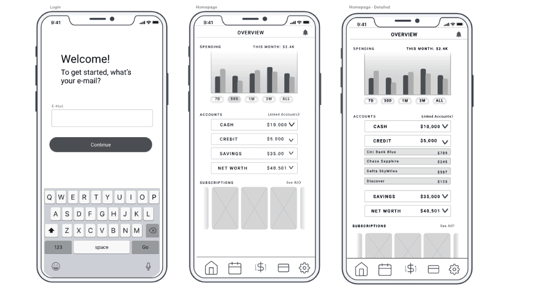
Wireframe
After creating a basic outline on paper, I moved on to create low-fidelity wireframes using Figma. The wireframes allowed me to refine the design further, providing a more concrete representation of the overall layout, structure, and functionality of the app. By creating wireframes, I was able to experiment with different design elements and test the usability of the interface before investing time and resources into a more high-fidelity design.
After creating a basic outline on paper, I moved on to create low-fidelity wireframes using Figma. The wireframes allowed me to refine the design further, providing a more concrete representation of the overall layout, structure, and functionality of the app. By creating wireframes, I was able to experiment with different design elements and test the usability of the interface before investing time and resources into a more high-fidelity design.
After creating a basic outline on paper, I moved on to create low-fidelity wireframes using Figma. The wireframes allowed me to refine the design further, providing a more concrete representation of the overall layout, structure, and functionality of the app. By creating wireframes, I was able to experiment with different design elements and test the usability of the interface before investing time and resources into a more high-fidelity design.
After creating a basic outline on paper, I moved on to create low-fidelity wireframes using Figma. The wireframes allowed me to refine the design further, providing a more concrete representation of the overall layout, structure, and functionality of the app. By creating wireframes, I was able to experiment with different design elements and test the usability of the interface before investing time and resources into a more high-fidelity design.
OUTCOME
OUTCOME
OUTCOME
Style Guide
Style Guide
Style Guide
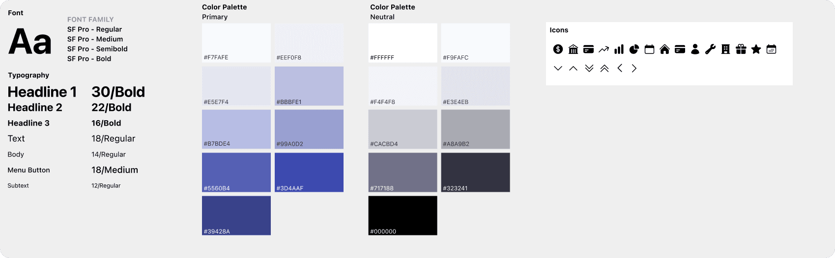
I developed a style guide that would provide guidelines for all visual design decisions. The style guide included a color palette, typography, and iconography that would convey the app's trustful and informative identity. I also established guidelines for how these design elements should be used across different screens and layouts, ensuring a cohesive look and feel throughout the app.
I developed a style guide that would provide guidelines for all visual design decisions. The style guide included a color palette, typography, and iconography that would convey the app's trustful and informative identity. I also established guidelines for how these design elements should be used across different screens and layouts, ensuring a cohesive look and feel throughout the app.
I developed a style guide that would provide guidelines for all visual design decisions. The style guide included a color palette, typography, and iconography that would convey the app's trustful and informative identity. I also established guidelines for how these design elements should be used across different screens and layouts, ensuring a cohesive look and feel throughout the app.
I developed a style guide that would provide guidelines for all visual design decisions. The style guide included a color palette, typography, and iconography that would convey the app's trustful and informative identity. I also established guidelines for how these design elements should be used across different screens and layouts, ensuring a cohesive look and feel throughout the app.
Final Design
Final Design
Final Design
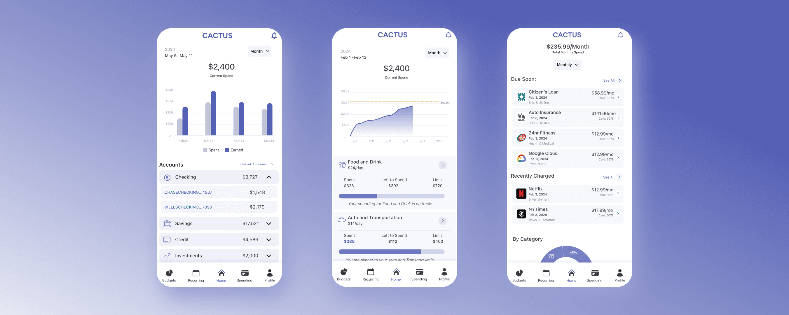
The main screen displays all the necessary information at once. The home screen displays all linked accounts from different bank establishments and a hub for all user flows. Displays current spending, account balances, current subscriptions, budgets, and the digital wallet.
The main screen displays all the necessary information at once. The home screen displays all linked accounts from different bank establishments and a hub for all user flows. Displays current spending, account balances, current subscriptions, budgets, and the digital wallet.
The main screen displays all the necessary information at once. The home screen displays all linked accounts from different bank establishments and a hub for all user flows. Displays current spending, account balances, current subscriptions, budgets, and the digital wallet.
The main screen displays all the necessary information at once. The home screen displays all linked accounts from different bank establishments and a hub for all user flows. Displays current spending, account balances, current subscriptions, budgets, and the digital wallet.
First Iteration
First Iteration
First Iteration
