MyBalto - Pet Rewards

myBalto is a pet technology company whose mission is to alleviate the financial burden of pet care for both owners and veterinarians. Through our innovative charitable veterinary software and our myBalto pet health app, we have created a technology-based ecosystem to help veterinarians provide better care for their patients while reducing the financial cost for pet owners.
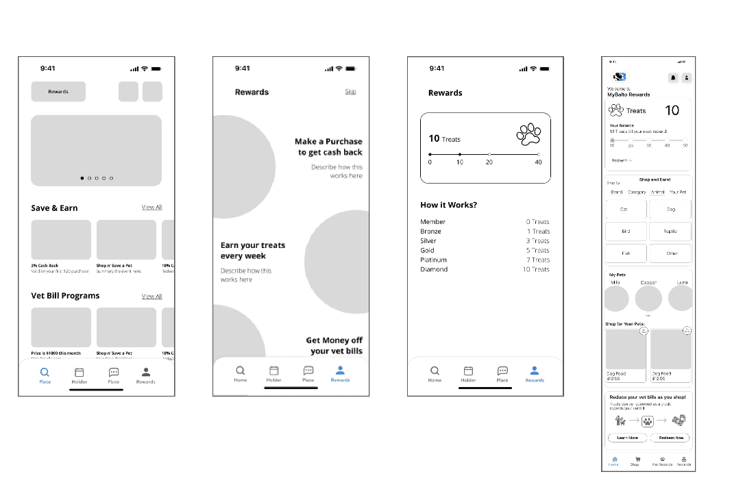
Problems
Users are perceiving the app as a shopping app rather than a rewards app.
Homepage is overwhelming with too many options to decipher between. Appears more like a landing page than an app home screen.
Reward points and structure are confusing.
Navigation is not clear as hovers are absent making it difficult to navigate and move through each page.
Goal
myBalto has recently redesigned the product brand and UI but has received initial feedback that pet owners are finding the new experience to be confusing. Their goal is to create a look and feel that is streamlined and facilitates a clear understanding of the product.
Revise the effectiveness of the homepage.
Re-structure the importance of app features from the user's point of view.
Communicate app's purpose:
Cashback on everyday pet purchases.
An innovative reward system where you earn "treats" for every purchase you make on myBalto that go towards helping reduce the cost of your submitted vet bills.
Persona
The user research stage of myBalto development process involved conducting interviews, surveys, and usability tests with individuals who own pets, manage their pet's health and wellbeing and also shop frequently at pet supply stores.
Jesse
Age: 38
Business Owner
PAIN POINT
Jesse finds it difficult to track his spending with his wife, wants to see overall where they stand so they can save for a house.
Ava
Age: 27
Marketing Associate
PAIN POINT
Ava is not confident in her financial management. She needs more information on her spending habits.
Molly
Age: 48
Stay-at-Home Mom
PAIN POINT
Molly finds it difficult to manage spending when everything is on auto-pay. She wants to oversee her children's spending as well.
Finally, we conducted usability tests to gather feedback on the app's design and features. We observed users as they interacted with the app and asked them to provide feedback on their experience.
Wireframe
I created low-fidelity wireframes using Figma. The wireframes allowed me to provide an overview of our proposed designs and refine the design further. This provided the CEO with a clear representation of the overall layout, structure, and functionality of the app.
Style Guide
I developed a style guide that would provide guidelines for all visual design decisions. The style guide included a color palette, typography, and iconography that would convey the app's fun and playful personality. I also established guidelines for how these design elements should be used across different screens and layouts, ensuring a cohesive look and feel throughout the app.
Final Design
The main screen displays all the necessary information at once, including the number of words learned, the number of words in training, and the button to access training. To make the app more engaging, we added a system of levels and rewards as a game element. Additionally, we included an extensive library of texts, featuring excerpts from popular shows, movies, cartoons, books, and magazines to provide users with a variety of materials and keep them interested in the app.
When users navigate to the dictionary, they can easily see the number of new words added and the source text from which each word was extracted. To help users memorize new words, we use a flash card technique that presents the word, its pronunciation, and multiple translation options. Our app also includes a special algorithm that tracks the number of correct answers, allowing users to evaluate their progress and level of memorization. To make it even more convenient for users, we include a special icon next to each word in the list that indicates how well it has been memorized.
When users navigate to the dictionary, they can easily see the number of new words added and the source text from which each word was extracted. To help users memorize new words, we use a flash card technique that presents the word, its pronunciation, and multiple translation options. Our app also includes a special algorithm that tracks the number of correct answers, allowing users to evaluate their progress and level of memorization. To make it even more convenient for users, we include a special icon next to each word in the list that indicates how well it has been memorized.
View Full Case Study