MyBalto Rewards
Pet shopping rewards app.
My Role
Product Designer
Duration
August 2022 - March 2023
Project
Key Skills
Ideation, Interviews, User Stories, Sketching, Information Architecture, Wireframing, Visual Design
Overview
Company Context
myBalto is a pet technology company whose mission is to alleviate the financial burden of pet care for both owners and veterinarians! Through our innovative charitable veterinary software and our myBalto pet health app, we have created a technology-based ecosystem to help veterinarians provide better care for their patients while reducing the financial cost for pet owners.
For this project's purposes, we will be focusing on the consumer-facing app which provides three distinct features:
1. Cashback on everyday pet purchases.
2. An innovative reward system where you earn "treats" for every purchase you make on myBalto that go towards helping reduce the cost of your submitted vet bills.
24/7 access to your pet's medical records with auto-syncing (coming soon)!
Project Goal
myBalto has recently redesigned the product brand and UI but has received initial feedback that pet owners are finding the new experience to be confusing. They are seeking your support to create a look and feel that is streamlined and facilitates a clear understanding of the product.
Design Process
UX Audit & Competitor Analysis
UX Audit
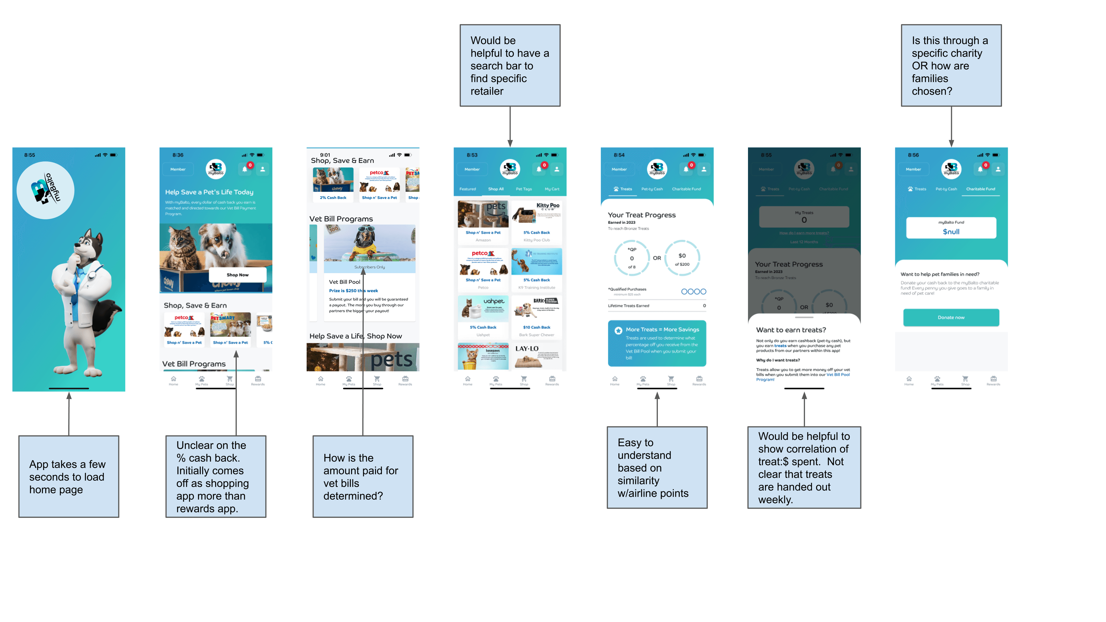
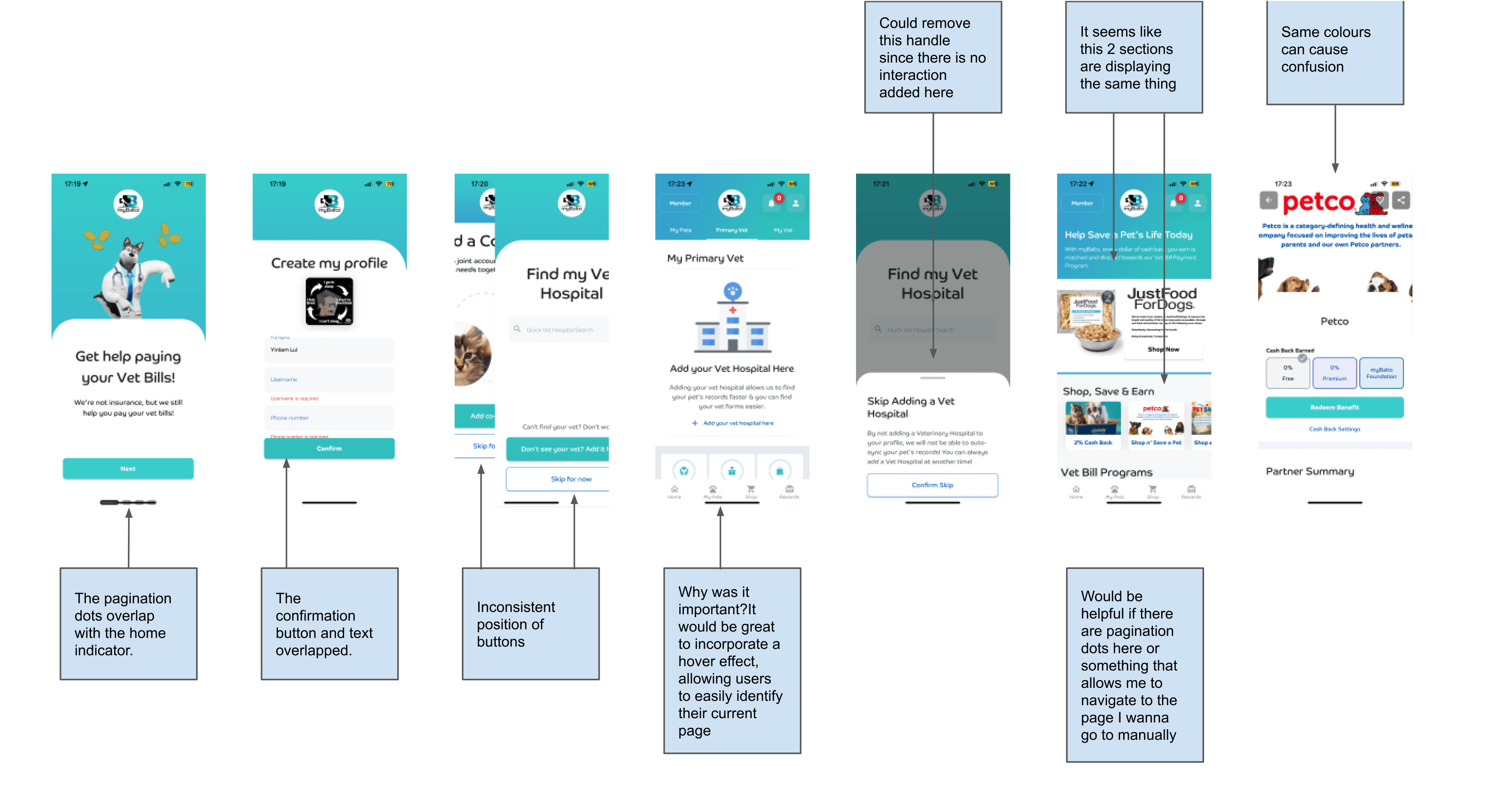

Key Audit Takeaways
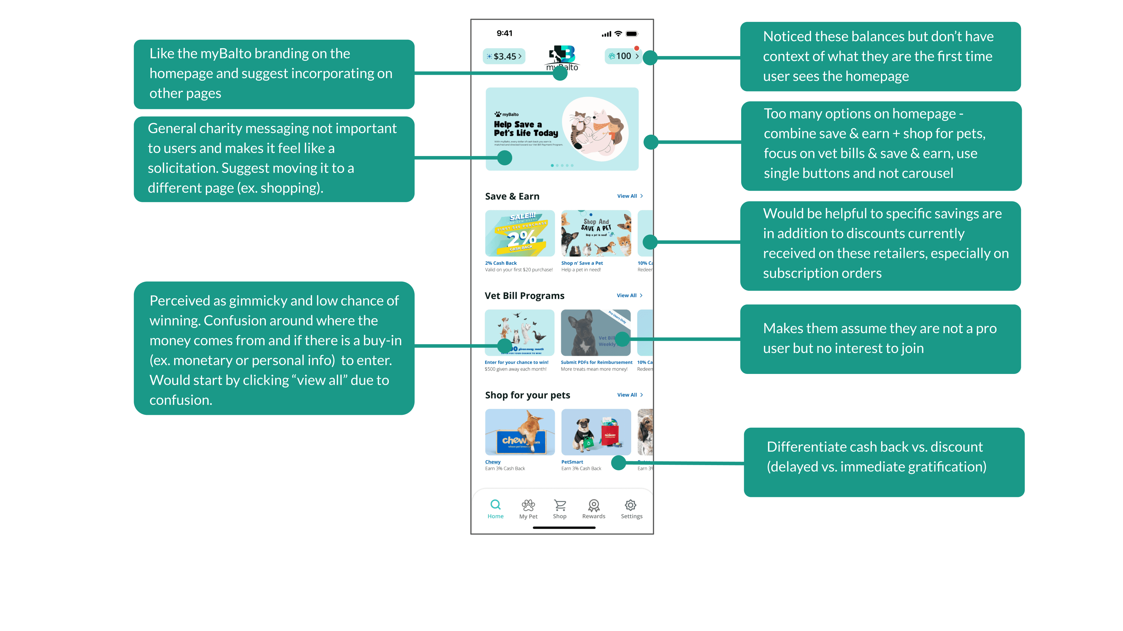
Perceived as a shopping app, rather than rewards app.
Homepage is overwhelming - many options, difficult to decipher between. Appears more like a landing page than an app home screen.
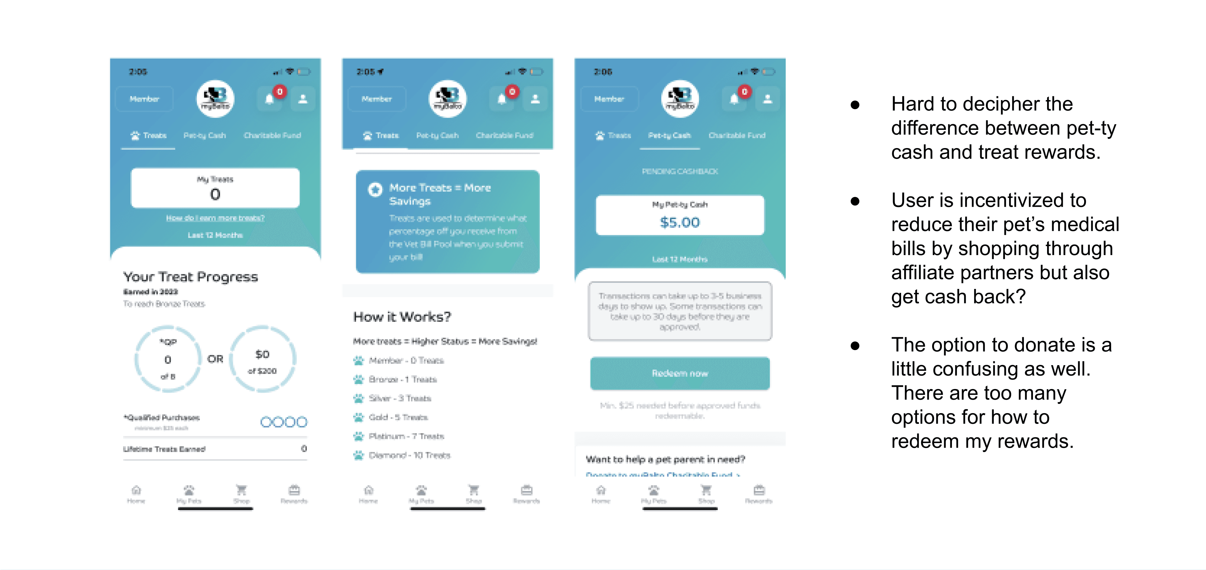
Hard to decipher the difference between pet-ty cash and treat rewards.
“Help Save a pet’s life” on the home screen is misleading. It looks like a charity app but does not communicate how shopping saves a pet’s life.
The detailed entry for all pet details before arriving at the home screen increases confusion about the app’s goal.
Navigation is not clear as hovers are absent, making it difficult to find the right buttons to process.
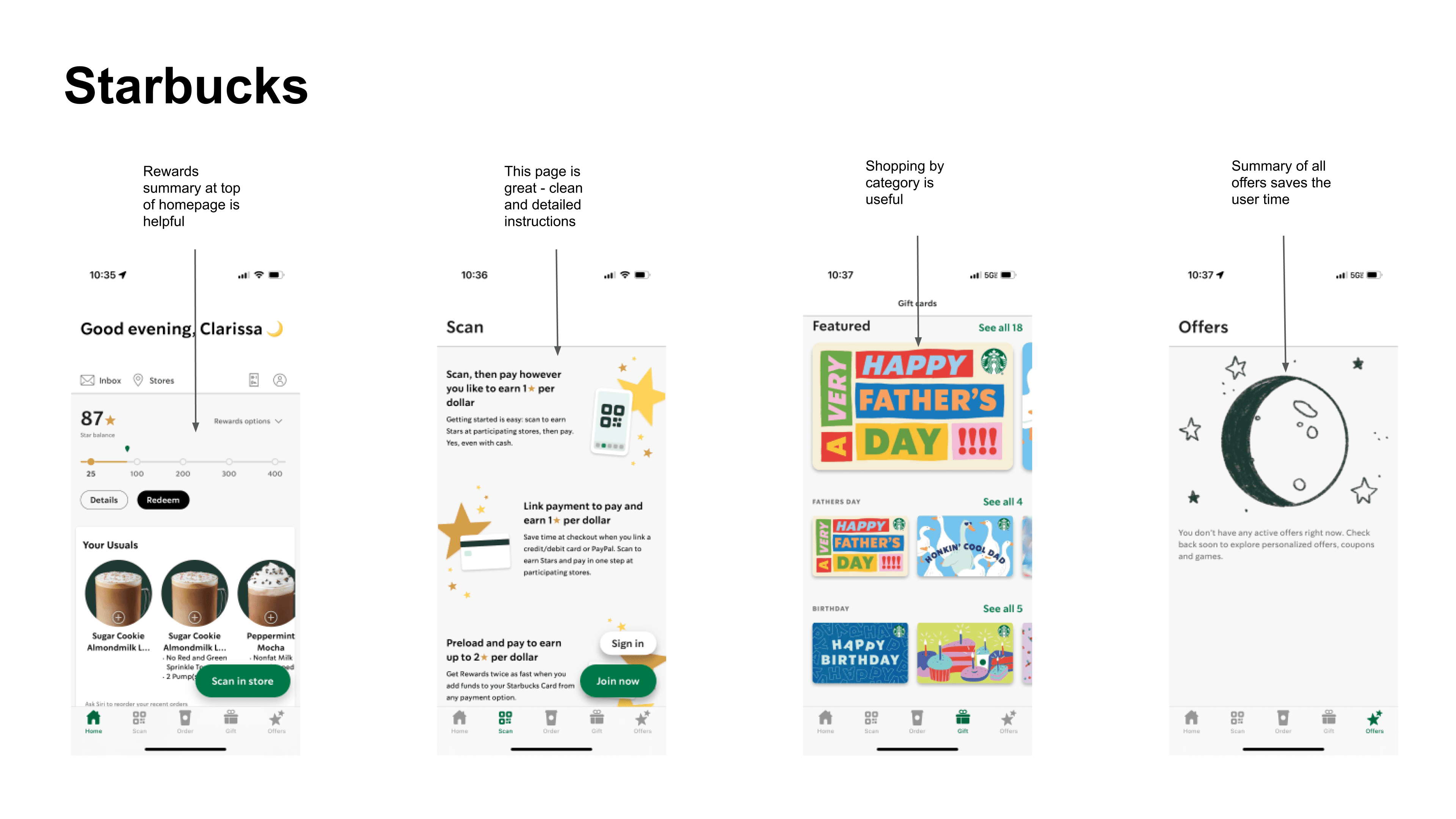
Competitor Analysis


Wireframes
We proposed a series of wireframe screens and tested them out initially to the original myBalto interface.
User Testing
User Test - Round One
Objective
Evaluate the effectiveness of the myBalto homepage.
Prioritize the importance of app features from the user’s point of view.
Assess revised wireframes.
Details
5 user interviews were conducted.
All participants are pet owners.
3 interviews conducted in person and 2 interviews were conducted online.
Wireframes tested.
What We Found
100% of pet owners rank cash back on vet bills as the most intriguing aspect of myBalto
Cashback on pet supply purchases ranks as the least intriguing aspect of myBalto.
Discounts are already offered by retailers on recurring or larger purchases.
Discounts of 15-20% start to catch the eye of users.
Shopping for pets is intriguing if the app compiles items from multiple retailers, simplifying the process and guaranteeing the best prices.

Recommended revisions based on user feedback on wireframes:
Develop a single prototype, with strong aspects from both prototypes, focused on:
Distinct sections of the app (shopping, cash back on pet supplies, money back on vet bills)
Personalized content based on pet.
The bottom navigation bar to simplify home screen.
A clear description of rewards, treats, and money back on vet bills.
Simple and easy to read screens.
How Might We ...
Simplify the experience for the user to reduce their vet bills?
Communicate effectively how to gain rewards and how they can be redeemed?
Articulate the rewards program better?
Brainstorm Direction
To optimize our timeline with MyBalto, I worked closely with my research partner to identify the most impactful screens for the redesign. We focused on revamping the key pages of the navigation, including Home, Shopping, Rewards, and My Pets. Our brainstorming session involved reorganizing the app's information architecture based on feedback from the CEO and user testing.
Our Design Plan
Design Solutions
01
Homepage Re-Design

Before
After

02
Rewards Page Re-Design

Before
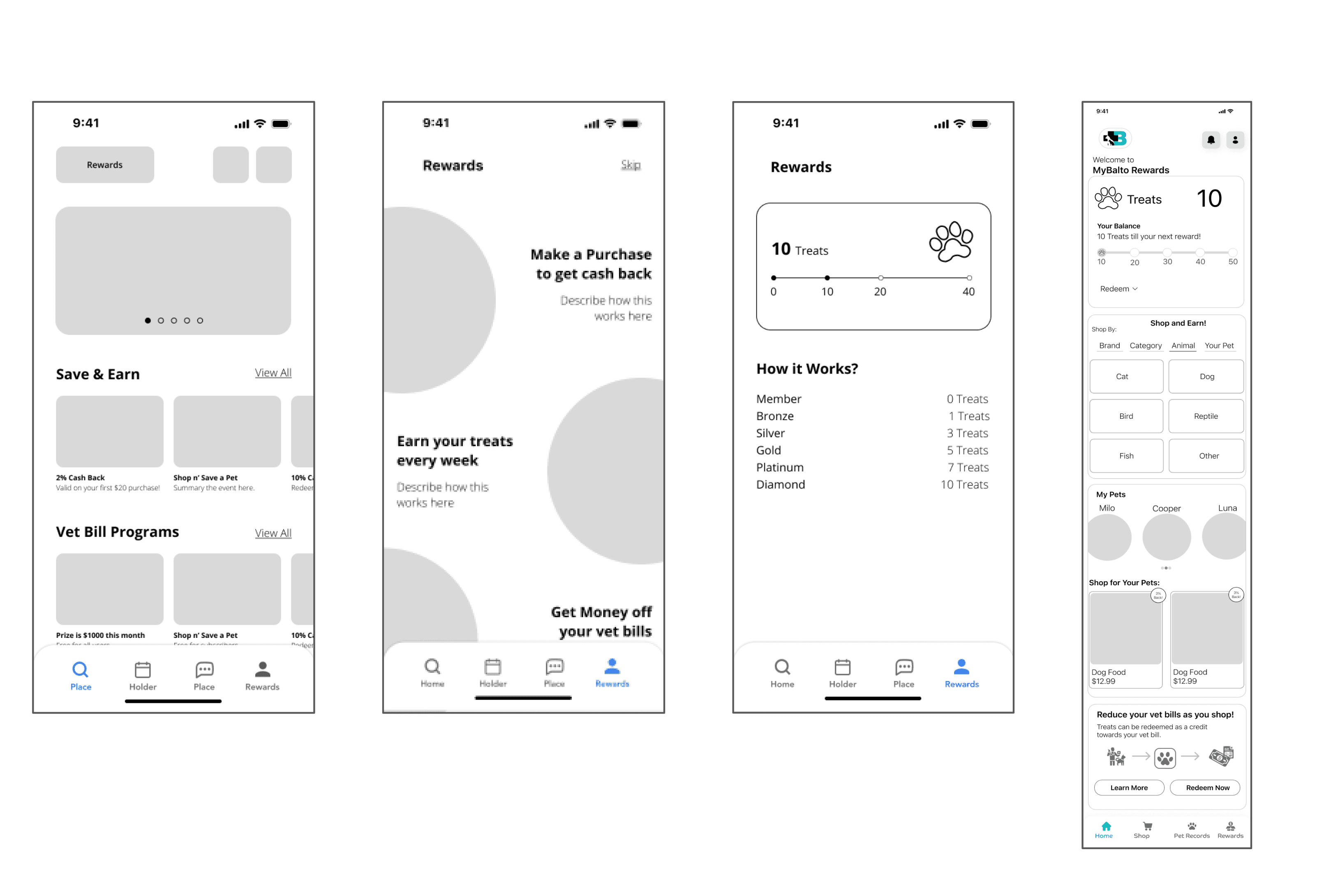
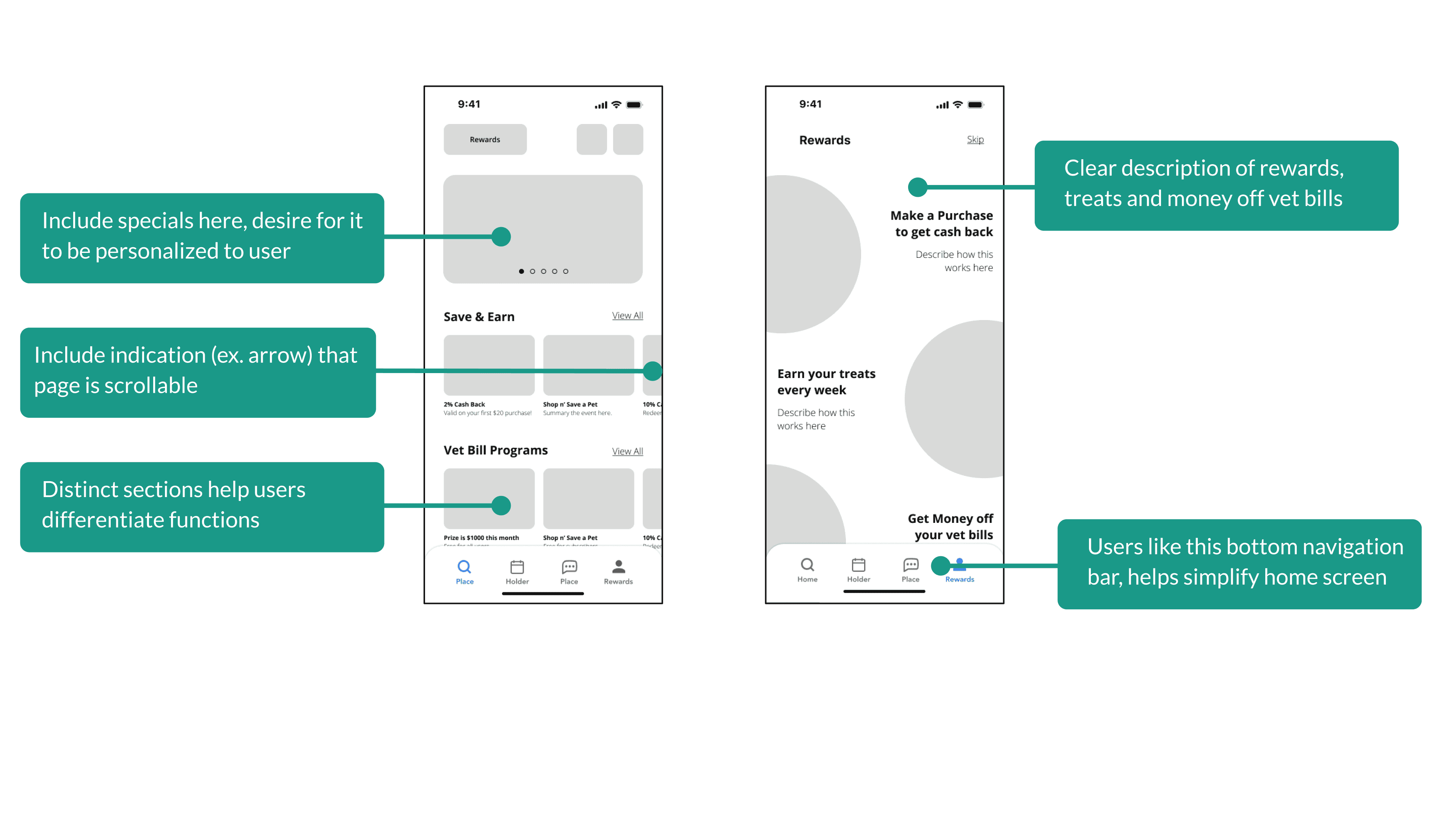
In the UX Audit, we found the page layout confusing with multiple names for Baltier points, pet-ty cash, and charitable fund. To enhance user experience, we decided to simplify rewards to Treats (points) or Cashback, consolidating all reward statuses into one easily accessible place.
After
We created a two-page flow for rewards, drawing inspiration from other reward apps. The first page is a scrollable explanation of each user journey, including how to earn cashback, treats, and money for vet bill reimbursement.
After the informative page, users arrive at the Rewards dashboard, which separates Treat (point) rewards and cashback earnings. This was done to address previous confusion in user tests about whether they are connected. On the rewards page, users can easily see how to earn treats and find ways to cash out or shop.


03
Shopping Page Re-Design

Before
The shopping page lacks appeal and feels like a mere display of brands and logos. The absence of a search function is a major drawback, making it difficult to find specific brands, retailers, or products.
After
In the revamped shopping page, we prioritized the search function and incorporated convenient buttons for filtering deals, popular items, and premium cash-back rates. Furthermore, the marketing banners in the carousel emphasize special events and attractive deals. The brand buttons are more inviting now, containing the cashback rate. Additionally, we offered a shopping feature for specific animals.

04
MyPets Home Re-Design

Before
The separation of Vet details and pet records in the my pets page created a weak user experience due to the need to navigate to multiple locations for information.
After
To enhance user experience, we streamlined vet information and records onto the individual pet page while introducing favorite items to encourage in-app shopping.


User Testing
User Test - Round Two
Objective
Evaluate the effectiveness of the myBalto prototype
Assess the effectiveness of high-fidelity designs. Did the prototype communicate the concept effectively?
Details
5 user interviews were conducted.
All participants are pet owners.
3 interviews were conducted in-person and 2 interviews were conducted online.
High Fidelity prototype tested.
What We Found


Conclusion
Recommended Next Steps
Simplify home screen
Make the rewards page the home screen OR have only save & earn and vet bill reimbursement on the home screen.
Further clarify treats vs. cash back vs. vet bill reimbursement
Ensure a clear difference between treats and cash back
Add an additional screen about vet bill reimbursement sweepstakes
Shift the onboarding flow from adding a pet to explaining how the app works, highlighting each section: shopping & rewards, vet bill reimbursement, and pet record localization.
Reflection
Communicating the app's purpose with users was difficult due to the multiple user journeys and complexities of this early-stage app. Combining shopping rewards, pet management, and veterinarian bill reimbursement posed a major challenge, as they are not typically grouped in technology. User testing for design functionality was often hindered by a lack of comprehension of the app's purpose.
As a visual designer, I had to think critically about how to communicate complex ideas. Although there are more design solutions to test, as a team we, provided valuable insights on improving communication for MyBalto.