


Overview
Company Context
Vélo is an e-commerce bike platform. They need to redesign their website to improve their product’s usability and increase sales.
Project Brief
Business Goals
Target User

Design and Project Plan

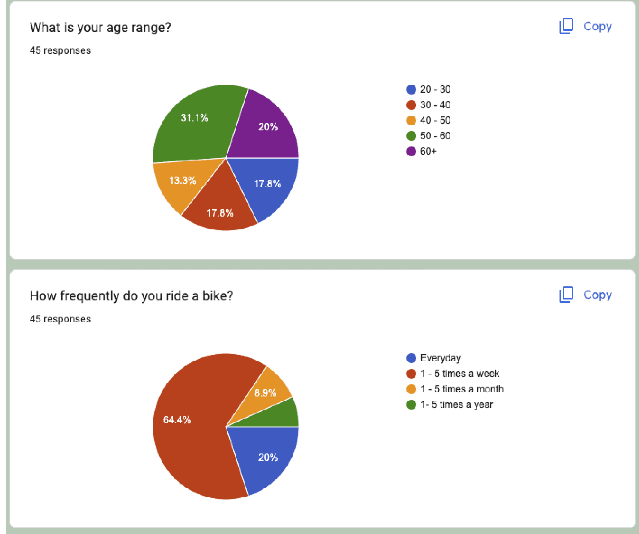
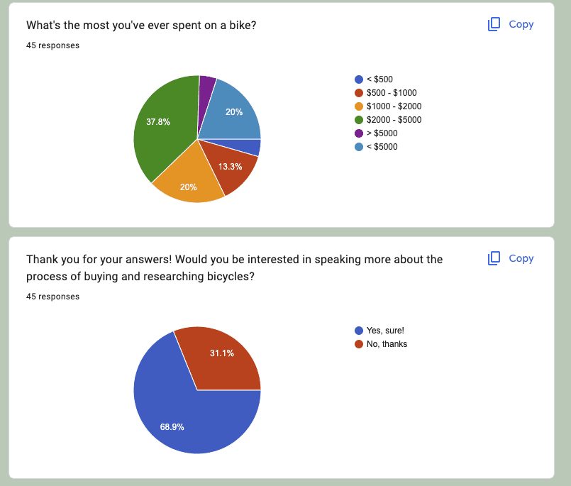
User Research
Research Goals
Understand the thought and research process of avid cyclists who purchase bikes.
Participants

Method
I joined a large cycling group on Facebook, Solitary Cycling. I said I was a student and doing research for a project. I asked members if they would fill out a brief form to help them understand. I asked if participants a few background questions and if they would be open to an interview.
Participant Form Results
User Interviews
I interviewed about ten people and received helpful information. I learned about the different types of bike riders: Road, Mountain, or Recreational. The shopping process looks a little different for each type due to the end-case use of the bike, but there are three core elements between them.
Analyze
1
An initial reason for wanting to purchase a new bike. A race, a trip, an upgrade, or a specific trail.
3
They compare frames, parts, price, and weight. This part often includes a test ride.
User Personas
Based on the information I gathered from my user research and interviews. I developed three personas that fit the demographic of Vélo. These personas are not specific to the end-use of the bike they are shopping for, but more the level of interest and experience they have riding bikes.

User Map
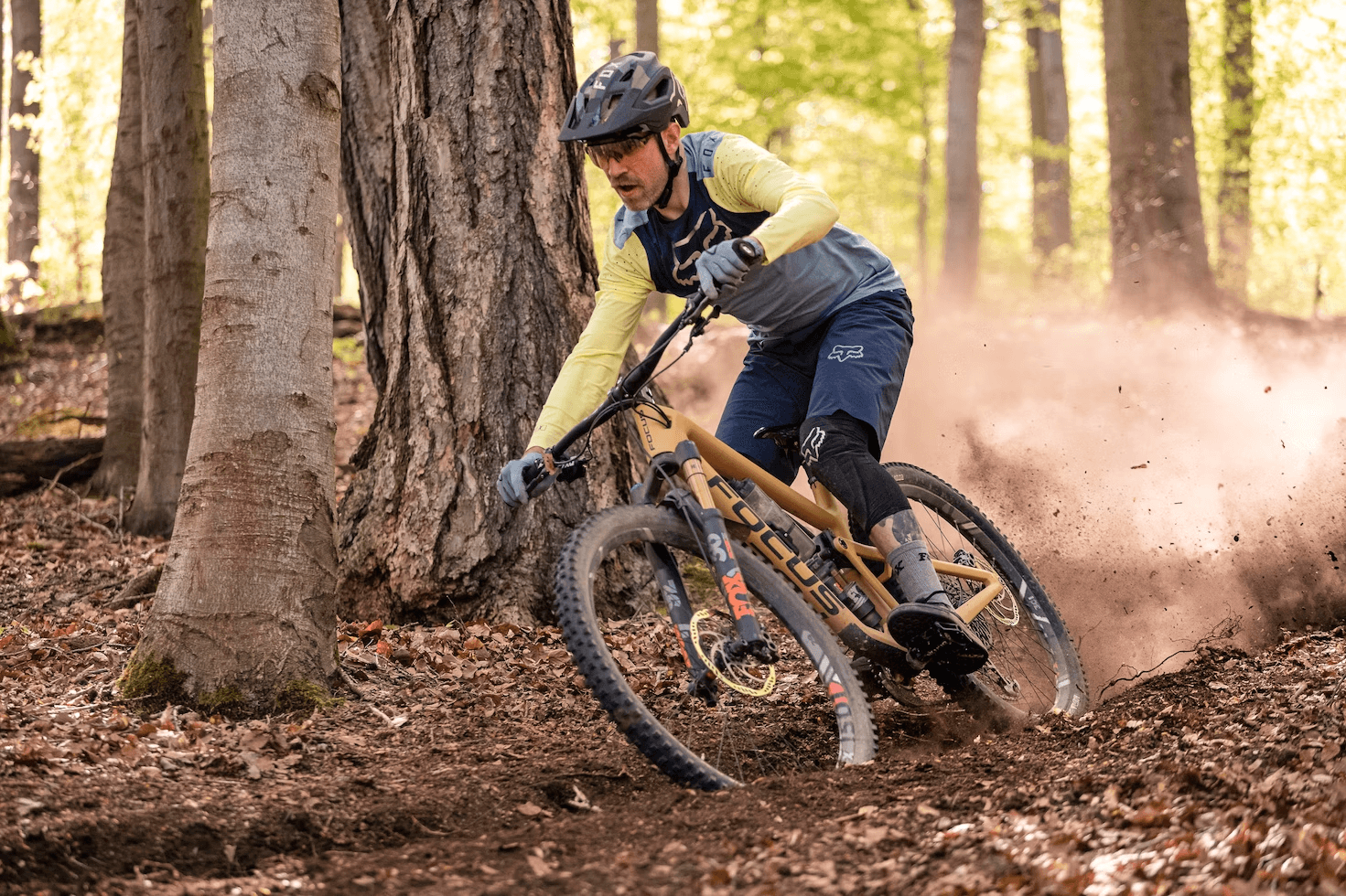
After building the three Personas for Vélo, I wanted to create a clearer picture of who our target users would be. I placed our “Expert” in two places to represent both road and mountain bike riders. Each category has a subset of rider levels and expertise. In the red box, there is a visual representation of our target user.

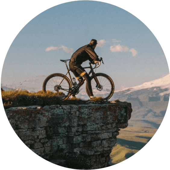
Road Cycling (Racing)

Mountain Biking
Trial Riding, rugged terrain, needs specific tread and wide tires.
Recreational Rider
Rides for leisure, fitness, and commuting. Specs can range with end-use with each rider but generally hybrid models
Research Takeaways
Research Constraints:
There were time constraints, as well as recruiting restraints with my research. I was unable to speak with any first-time buyers of bikes. By recruiting participants from a cycling Facebook group, I acknowledge that some of my results are slightly biased. To negate this, I spoke with someone whose family owns a bicycle store and he was able to provide me with a more in-depth review of the differences between an advanced and beginner bike rider.
To begin the branding process for Vélo, I wanted to get a feel for the bike market. I looked at current the most popular and prestigious bike brands. I found that the majority of the market uses black and white, or a primary color.

Design Style Guide
Following the lead of my competitor branding recap, I chose to incorporate the Black, White, and a primary color concept into Vélo. Vélo has a modern, neon “Vélo Yellow” as the primary color, a taupe grey as the secondary, and Black and White. I designed the logo to match the same concept as if to easily fit on the frame of a bicycle.
Brand Personality
Design Aesthetic
Color Pallet


Typography
User Flow
This is the chosen user flow for Vélo, and is what led the direction of the wireframes and initial prototype.


Tasks
Browse bikes.
Review the individual product page.
Review Rider Profile.
Review the Bike Comparison page.
Add a bike to the shopping cart.
Checkout as a guest.
Findings

Updated User Flow


01
Design Solution
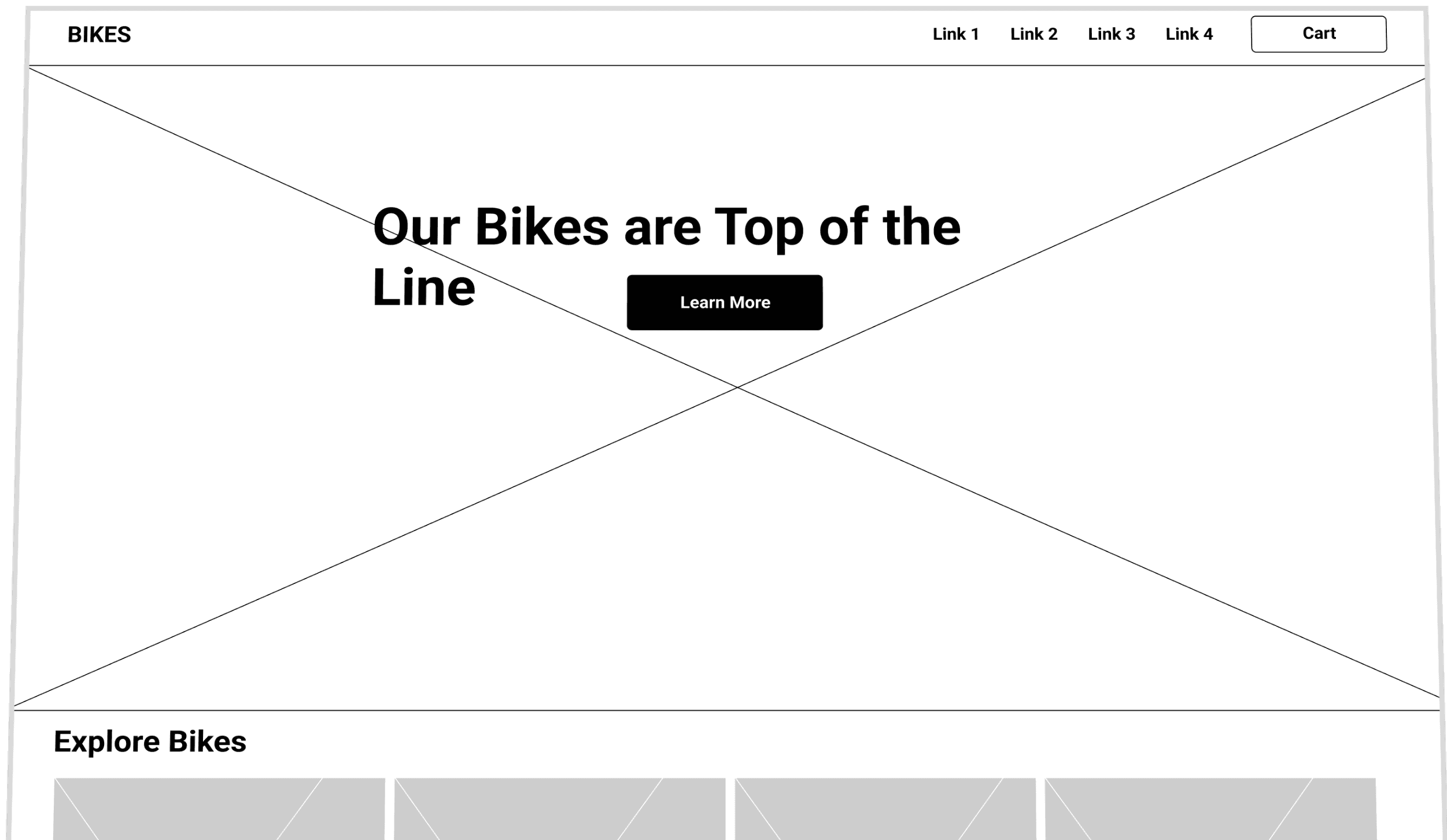
Homepage
On the homepage, I chose to use full-width banners with images that fit the design style and branding of Veló.
The navigation allows the user to shop for end-us first then, browsing highlighted products, and familiarize themselves with the brand's story.


03
Design Solution
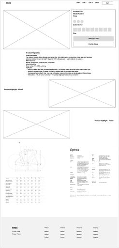
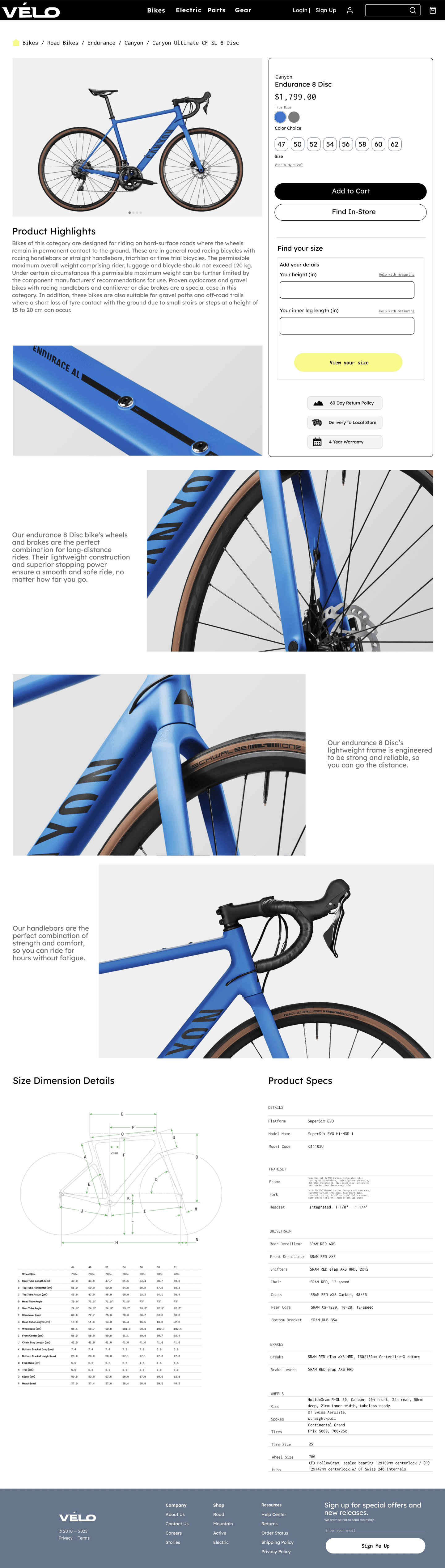
Product Page
This is the individual product page. Displayed are the key elements that are crucial information for the shopper. Instead of the Rider Profile, there is a Find Your Size placed directly near the size selection and Add to Cart Button.
In addition to high-quality images and key product highlights. There are Product Spec and Dimension Details. This is key to fit our Expert User Persona who looks at the granular details of each bike part.
04
Compare Page

Design Solution
05
Below is the view of the shopping cart and the guest checkout. A requirement in the project brief was to capture guest e-mail during checkout. Guest checkout only has e-mail capture to proceed, ensuring that email is captured 100% of the time.


User Testing
Tasks
Findings
Screen Iterations Post Testing


Reflection
Takeaways
This project aimed to improve profitability, conversion rates, and enhance the shopping experience. Leveraging my merchandising background, I made design decisions that were guided by both user research and product manager insights. Additionally, I prioritized maintaining a visually appealing design and staying true to the branding.