Case Study
SAVR Recipes

Overview
I completed a one-person Google Ventures Design Sprint. A design sprint is a five-day process for answering critical business questions through design, prototyping, and testing ideas with the customer.
Company Context
SAVR is a recipe database and cooking app. They received feedback from the users about confusing directions and a poor cooking experience.
Project Brief
Background Brief
SAVR, which is a new startup that shows hundreds of recipes and cooking tips for at home chefs. They have an active community of users who rate and review recipes for others. SAVR has experienced difficulty with their user experience because the users are disappointed with the outcome of their meals. They don’t feel the instructions are clear, or easy to execute.
User Persona
Nick, 29
Los Angeles, CA
Cooks three nights a week, usually for himself but sometimes him and his girlfriend.
He enjoys cooking and trying new recipes. He thinks a recipe is the best way to learn some of the most basic cooking techniques.
Sometimes Nick is unsure he’s on the right track halfway through preparing the meal.
Nick isn't always clear on what’s next and how he can prep a few steps ahead. This often leads to mistakes or a lot of time wasted.
Nick gets stressed out trying to refer back to his phone every time a new technique or step is introduced.
Design Constraints
Must be designed as a feature in a mobile app.
Create a better experience for users when it’s time to cook!
Recipes are currently written as text, in ordered steps from start to finish.
Day One - Map
Information Provided by the Product Manager
Complex recipes are rated the lowest of the app.
The order of preparing the ingredients is not in the most logical and efficient order.
When introducing a new cooking technique, it's not highlighted or instructed.
This chaos is causing overwhelm in the kitchen while under pressure (rushing to chop veggies while the meat is cooking).
If it’s a dish that comes from a culture the user is not familiar with, the new ingredients and spices need to be taught.
Drafting a possible end-to-end experience a user might have with your product by making a map

Key Takeaways
After making the map, I identified the most crucial point of the end-to-end experience, which is executing the recipe directions in chronological order. This would be the focal point of the sprint exercise for the four days.
Target of Sprint Exercise
The process of executing recipe directions in chronological order.
How Might We Question
How might we simplify the directions and experience of cooking for our users?
Day Two - Sketch
After establishing the target of the sprint, the second day begins with gathering inspiration and focusing on the solutions. Each participant is asked to sketch possible solutions following a four-step process that emphasizes critical thinking over artistry.
Lightning Demo’s
This was a quick analysis of other apps centric to cooking. I looked and pulled key elements of how they walk the user through the cooking process.
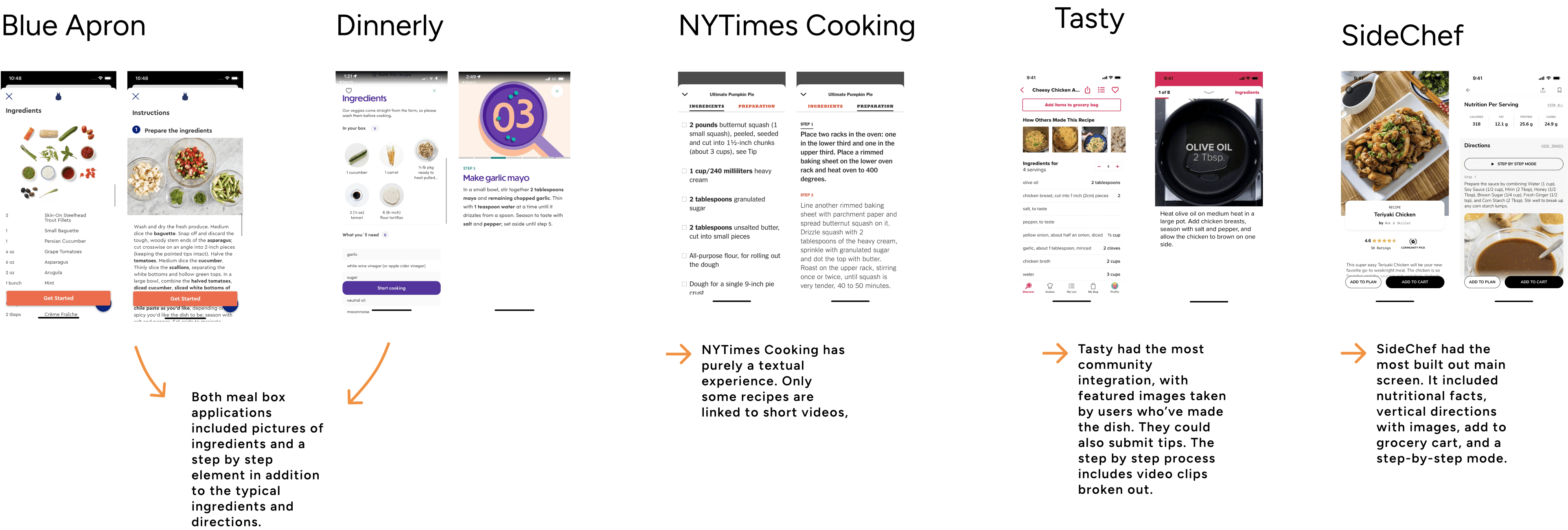
Lightning Demo Takeaways
Visual cues are the strongest elements among the apps.
Step-by-step mode (one step per screen) is a great example of simplifying the recipe directions.
The more information provided, the better the experience for the user.
SideChef has nutritional facts, vertical scroll directions with images, add to grocery cart, and a step-by-step mode.
I’d like to include this framework in to my design and test possible solutions.
Crazy 8 Sketching Exercise
For this exercise, we set a timer for eight minutes and attempted to sketch one screen per minute. It focused on rapid brainstorming rather than perfect visual design.
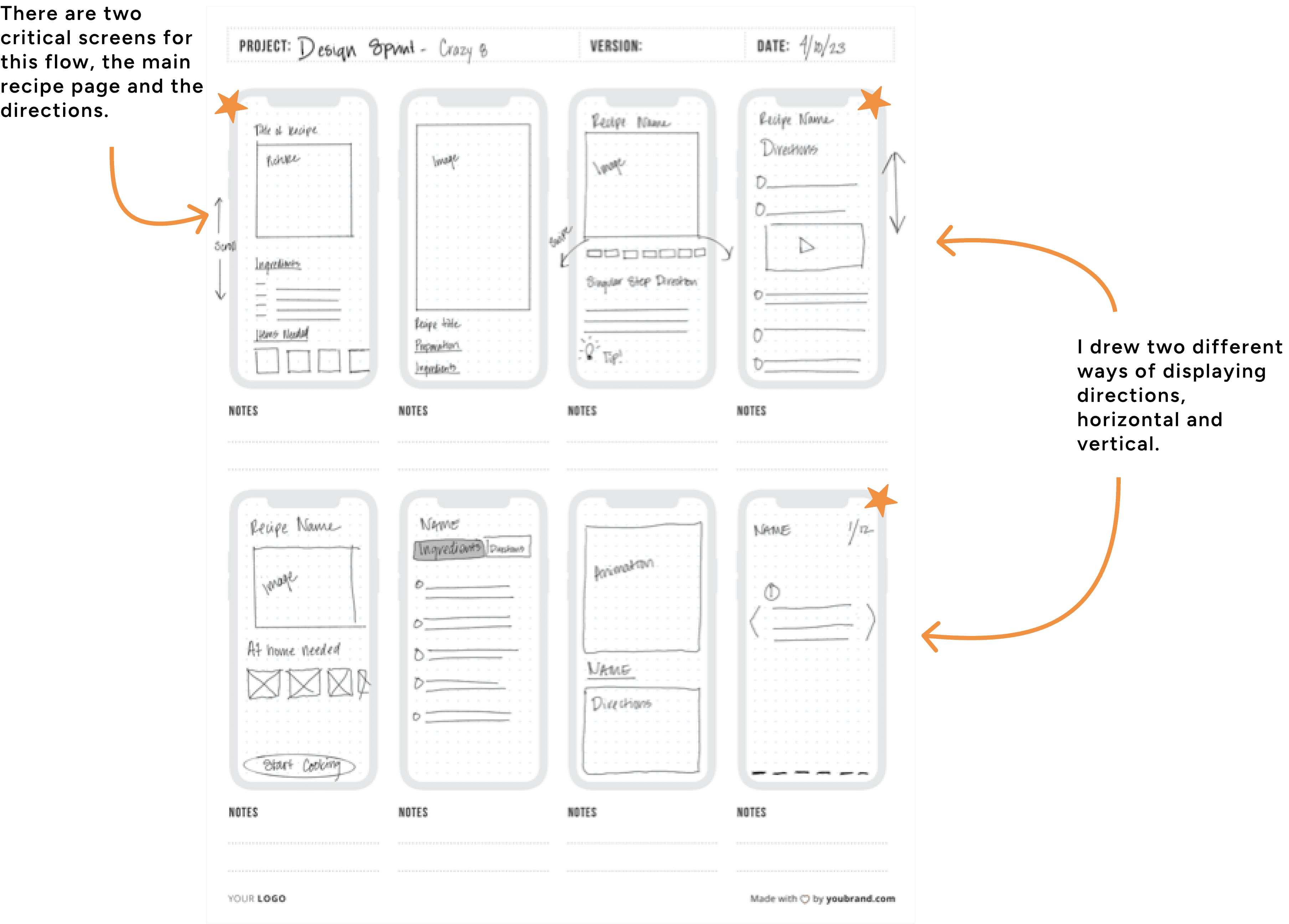
Solution Sketches
Sketch Takeaways
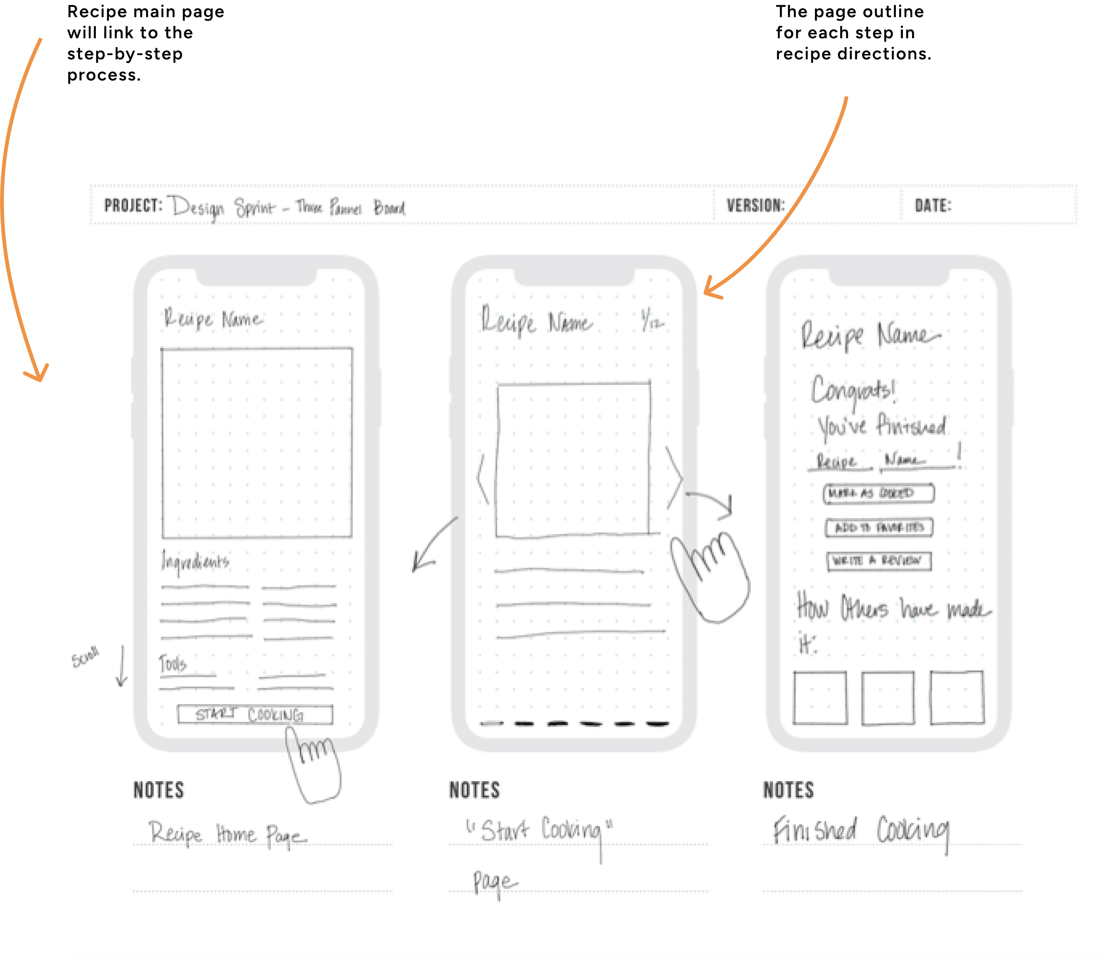
Referencing our target problem and lightning demo takeaways, I sketched three screens as a potential solution. There would be a recipe homepage, a step-by-step flow, and a page for once the user has finished cooking.
Day Three - Decide
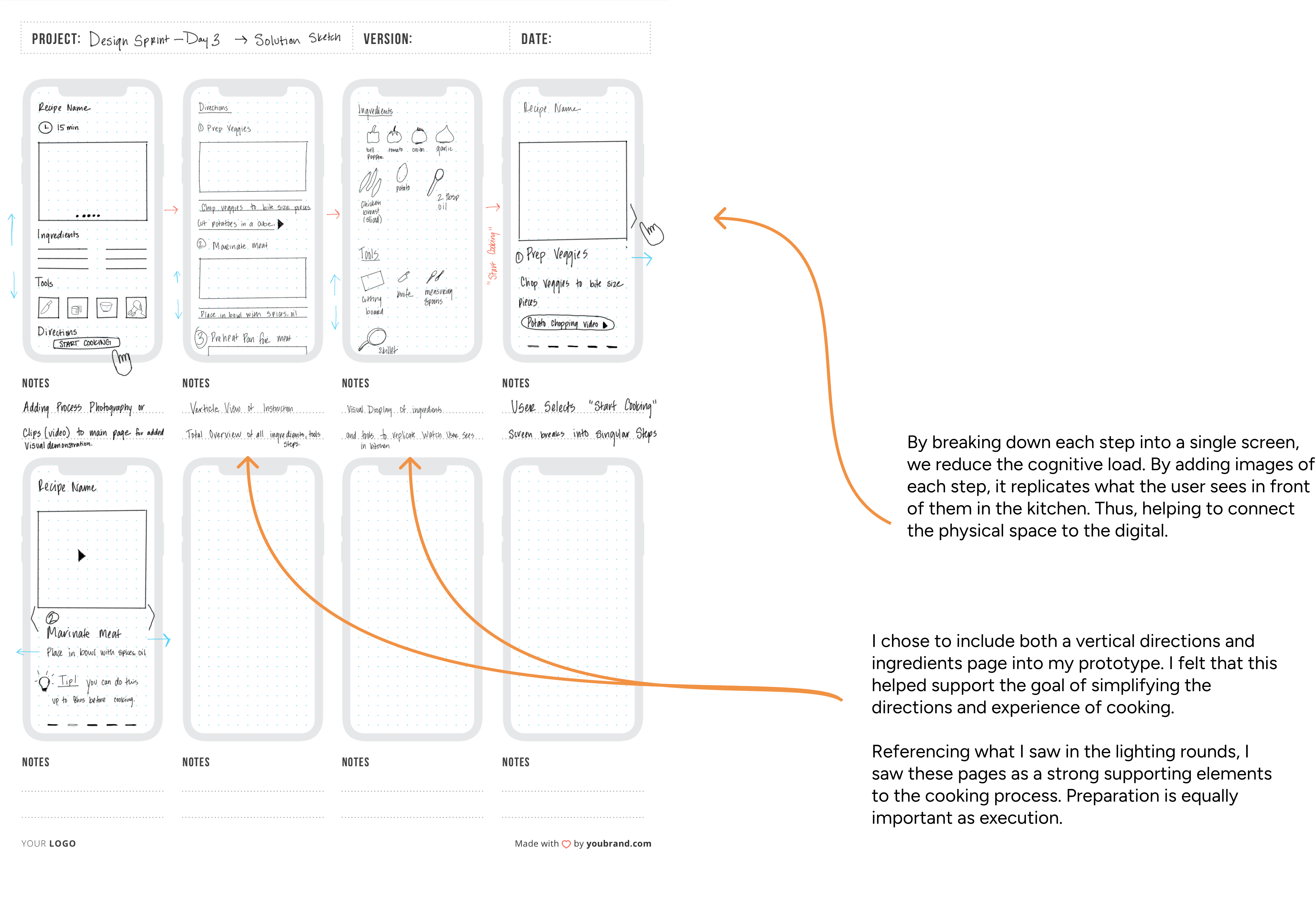
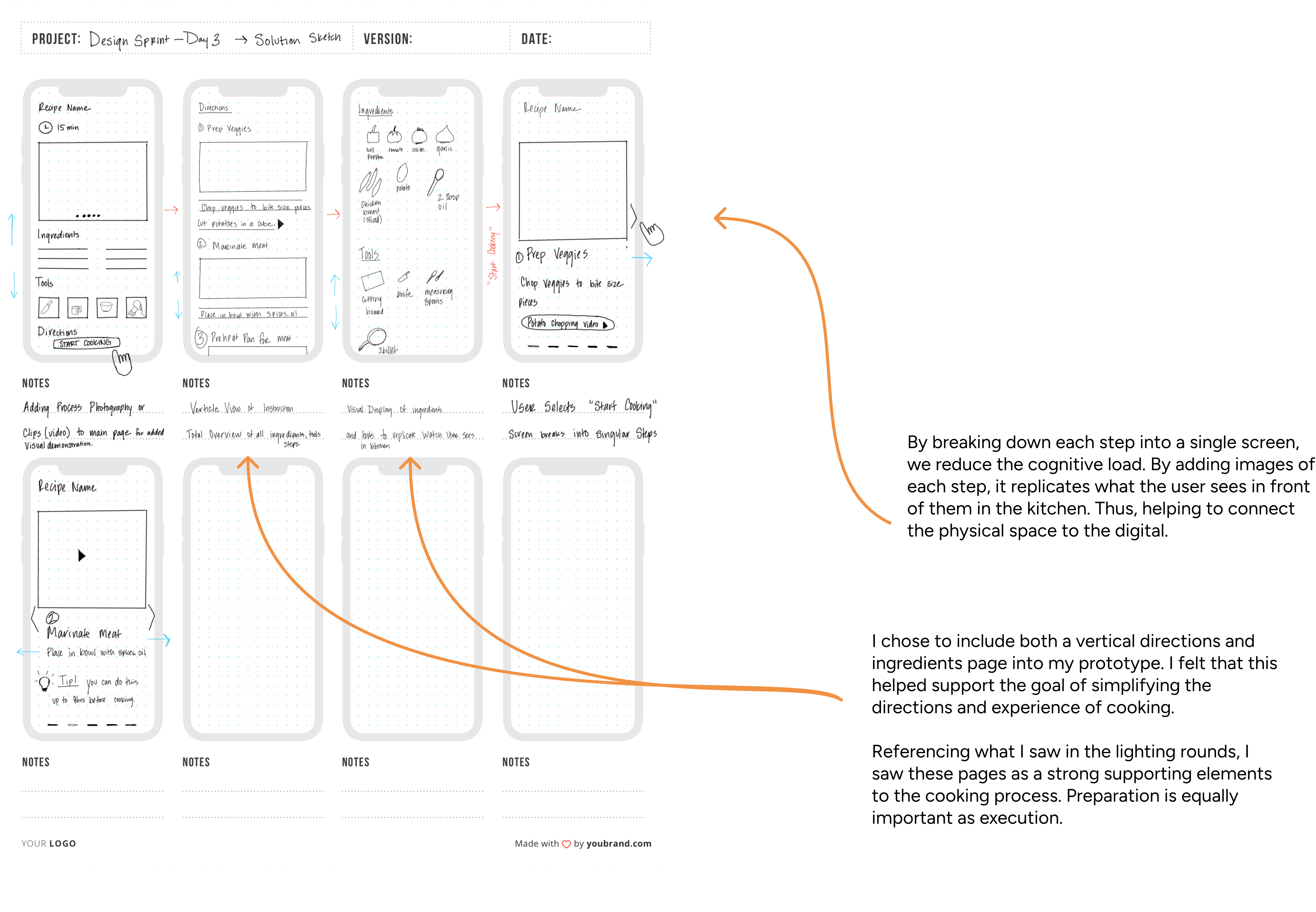
On day three, I created a storyboard for the user flow for both solution screens.
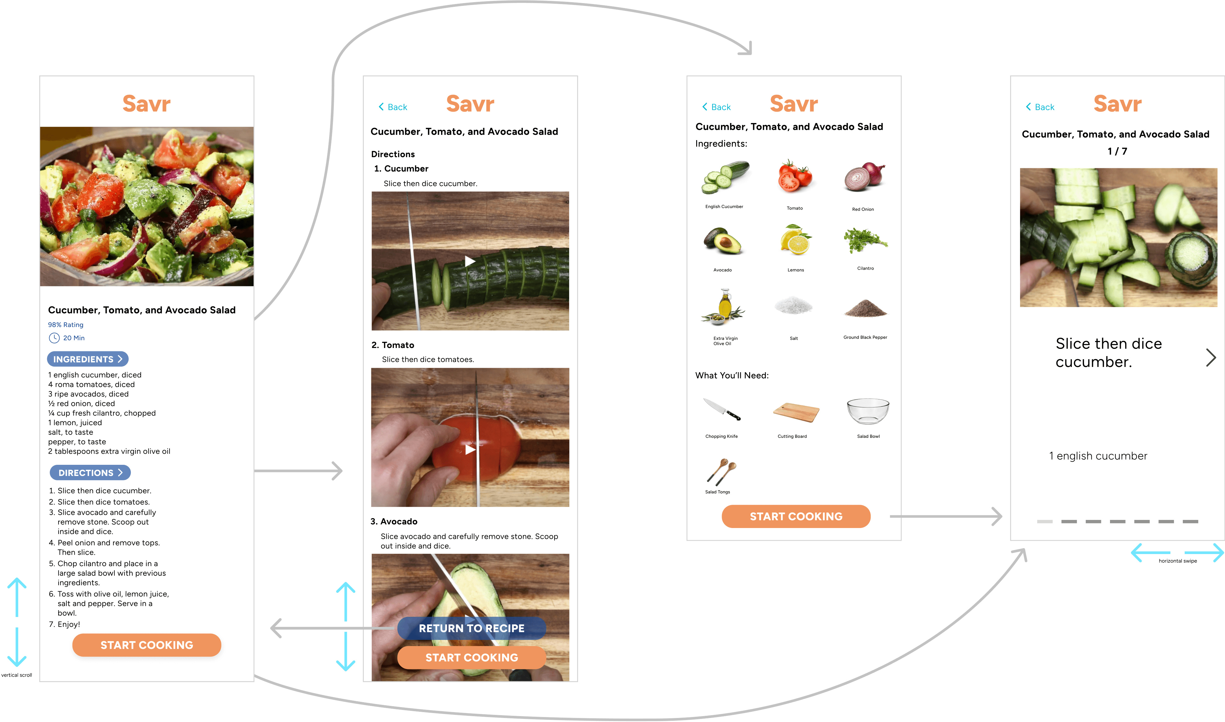
The main recipe page is crucial in the beginning phase of the process, as the user must know which ingredients are required and then obtain those ingredients. Secondly, having the directions laid out with the required kitchen tools. Finally, the start cooking sequence as the user starts cooking.
The goal for myself as the designer was to make the process as approachable and visually informative as possible. This supports the target problem of simplifying the directions and experience of cooking for our users.
Storyboard
Day Three Takeaways
Choosing to add additional pages as supporting elements to make the cooking process easier.
In the storyboard, we added a vertical scroll overview page of the directions only, and a visual display of the ingredients and cooking tools needed to complete the recipe.
Adding an image of the step for each page.
Day Four - Prototype
On the Fourth day of the sprint, I created a prototype for the Savr app. I initially used Marvel for ease of creation and time saved. They have great prototyping functions and was easy to generate a workable prototype quickly. However, there were some design constraints that I felt held back the quality of the design.
Initial Prototype
Directions Flow

Day Five - Test
On the fifth day of the sprint, I tested my prototype with five participants. These are people that are close to me. We did the tests over Zoom, and some in person.
I watched and gathered information as they navigated the prototype. Some participants sent me their feedback via text as they weren’t available for a call.
Test Objective
Understand the effectiveness of the prototype, and how intuitive is the user interface.
Participant Tasks and Questions
Move through the app as if you are cooking the recipe in real time.
If at any point the participant struggled in the app, what did they notice?
What is the best part of the app? What is the worst part?
Is there any general feedback?
Feedback
Positive
The instructional portion is great. The videos help you make sure you’re doing it right.
Being able to see how many steps there are at first glance.
Users liked being able to visually see the ingredients and tools, so they can mentally take an inventory of what they already have in their kitchen.
Users liked the instructional video embedded in the directions, especially when it’s a technical skill like chopping.
Negative
Ingredients should be on the directions page.
On the homepage, the ingredients and directions should be visible without scrolling.
When the user clicks “start Cooking” it takes them to the directions in the verticle scroll and then ingredients, and then the step-by-step flow. It should have a direct link to the step-by-step flow.